Posts: 117
Threads: 23
Joined: May 2017
Reputation:
7
Gimp version:
Operating system(s): Windows (Vista and later)
I am posting a first example of:
- kind of material I may start with (choosen because it was likely my very first project with Gimp, started in 2011)

- kind of result I am aiming at: last version, fairly recent--can be improved if/when I feel like it and have learned some more, found a font I like better...

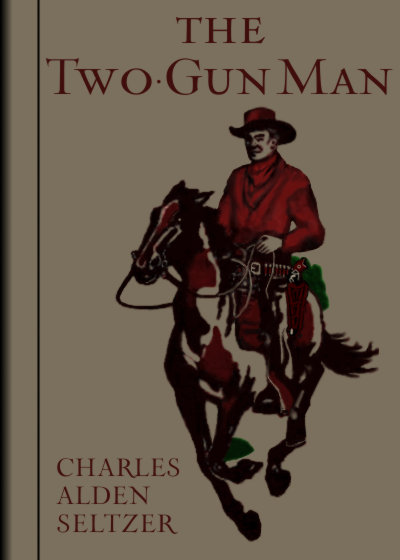
Trouble: remove ALL the background from the illustration (it can be seen that it must be removed also from holes in the picture) avondind raggedness in the borders, and querly coloured semitransparent pixels, wich play havoc when giving a new, uniform colour to the picture.
Advice certainly appreciated.
Thanks!
Posts: 188
Threads: 27
Joined: Sep 2017
Reputation:
10
Operating system(s): Windows (Vista and later)
Linux
I usually duplicate the image layer, and then run either a Gmic stamp or posterize filter on it. This just helps me quickly select the background areas. Of course it always requires a clean-up. Sometimes I adjust the brightness and contrast first to help make the foreground stand out.


Sometimes I need to feather a bit or blur or whatever. No two images are the same of course.
If I use the posterize filter, then it is helpful because it is easy to drag the magic wand to get the area a want, and I have noticed that using 'select by Lch hue' works best in many situations.
Posts: 117
Threads: 23
Joined: May 2017
Reputation:
7
Gimp version:
Operating system(s): Windows (Vista and later)
(09-16-2018, 10:43 PM)mholder Wrote: I usually duplicate the image layer, and then run either a Gmic stamp or posterize filter on it. This just helps me quickly select the background areas. Of course it always requires a clean-up. Sometimes I adjust the brightness and contrast first to help make the foreground stand out.
Sometimes I need to feather a bit or blur or whatever. No two images are the same of course.
If I use the posterize filter, then it is helpful because it is easy to drag the magic wand to get the area a want, and I have noticed that using 'select by Lch hue' works best in many situations.
Thanks for your advice. Unfortunately, I haven't got the Gmic plugin--looking at it some time ago, I saw too many, too confusing options, most of which I simply didn't need--i.e., everything related to photos.
Anyway, if I find the package, I may try it.
Thanks again.
Posts: 6,562
Threads: 286
Joined: Oct 2016
Reputation:
576
Gimp version:
Operating system(s): Linux
(09-16-2018, 08:53 PM)carmen Wrote: I am posting a first example of:
- kind of material I may start with (choosen because it was likely my very first project with Gimp, started in 2011)
Is there a full-size version (or at least a significant extract) somewhere?
Posts: 117
Threads: 23
Joined: May 2017
Reputation:
7
Gimp version:
Operating system(s): Windows (Vista and later)
(09-17-2018, 05:18 AM)Ofnuts Wrote: (09-16-2018, 08:53 PM)carmen Wrote: I am posting a first example of:
- kind of material I may start with (choosen because it was likely my very first project with Gimp, started in 2011)
Is there a full-size version (or at least a significant extract) somewhere?
I am sorry--the beginning of that cover project was so long ago, I hadn`t learned yet to keep the largest/best original available. Here is the scan as just picked from archive.net

of which my original post was just a reduced version.
Googling for "Charles A Seltzer" "The Two-Gun Man" in images--standard when looking for book covers--you find only an edited version--cleaned of doodles and with some filtering. Of course, one of my reasons to reopen a cover project is bumping into an improved source. Unfortunately, they aren't so plentiful, especially for such vintage works (early 1900s): thus the fun.
Thanks!
Posts: 7,316
Threads: 156
Joined: Oct 2016
Reputation:
1,024
Gimp version:
Operating system(s): Linux
I usually go for a layer mask and how to create one is really often a matter of preference.
It is worth revisiting the gmic plugin. The Windows installer works well, puts the files where they are supposed to be.
For an initial mask, the gmic interactive foreground extract can get a reasonable result and usually quick, although in this case the lettering makes a bit more work. Still only a couple of minutes.
screenshot https://i.imgur.com/9PxfHu2.jpg
Then as a starting point for more comprehensive touch-up / new background.
screenshot https://i.imgur.com/uqo42dv.jpg
Posts: 117
Threads: 23
Joined: May 2017
Reputation:
7
Gimp version:
Operating system(s): Windows (Vista and later)
(09-17-2018, 09:34 AM)rich2005 Wrote: I usually go for a layer mask and how to create one is really often a matter of preference.
It is worth revisiting the gmic plugin. The Windows installer works well, puts the files where they are supposed to be.
For an initial mask, the gmic interactive foreground extract can get a reasonable result and usually quick, although in this case the lettering makes a bit more work. Still only a couple of minutes.
screenshot https://i.imgur.com/9PxfHu2.jpg
Then as a starting point for more comprehensive touch-up / new background.
screenshot https://i.imgur.com/uqo42dv.jpg
Thanks!
A question: should I begin that project from scratch now, I would:
1. Extract the text: select by color->crop selection->grow selection to include the text plus a little border->make a copy and paste as new layer (keeping it for reference)->return to base layer->heal selection (resinthetizer plugin)->touch by hand as needed.
2. Make paths for the fine lines (briddles, etc.) that will likely get messed up in the next step: anyway, at my chosen size (400x560 px) they look much better as stroked paths.
2. Apply NL filter and/or 'blur simple bilateral' BEFORE attempting to extract the figure from the background.
The idea being to fill-in/regularize as much as possble the graining of the cloth texture in the figure.
Is there some problem with such an approach? I may be missing something...
Posts: 6,562
Threads: 286
Joined: Oct 2016
Reputation:
576
Gimp version:
Operating system(s): Linux
Is this a photo or a scan? Did you make them yourself (because changing the technique can greatly help)?
Posts: 117
Threads: 23
Joined: May 2017
Reputation:
7
Gimp version:
Operating system(s): Windows (Vista and later)
(09-17-2018, 11:39 AM)Ofnuts Wrote: Is this a photo or a scan? Did you make them yourself (because changing the technique can greatly help)?
Downloaded scan--from archive.net, and so presumably optmized for OCR; also, some years old. I am afraid the conditions are like that.
Posts: 8
Threads: 3
Joined: Nov 2019
Reputation:
0
Gimp version:
Operating system(s): Windows (Vista and later,32-bit)
11-07-2019, 11:01 PM
(This post was last modified: 11-07-2019, 11:03 PM by tommik128.)
(09-16-2018, 10:43 PM)mholder Wrote: I usually duplicate the image layer, and then run either a Gmic stamp or posterize filter on it.
Thanks! This seems to be very effective way of how to clean the background grain in a scanned image. I was kinda struggling how to do this sort of "one color" cleanup without having to use any smoothing filters that also affect the foreground that I do not want to be changed... And of course avoiding the time consuming selection by hand.
|


