Thread Rating:
  • 0 Vote(s) - 0 Average
  • 1
  • 2
  • 3
  • 4
  • 5
Aligning multiple radius image frames to swap in different images?
#1
Aligning multiple radius image frames to swap in different images?

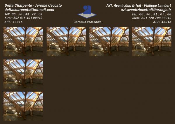
Quote:A couple of highly skilled lads have asked me to sort their postcard out.

I'm happy with the text and artisan logo concept.
The borders need tweaking as do the letter spacing... but that's fine.

The image size is almost there (to have equal borders).
It has to be 6 or 12 images.
12 shows more skills.... 6 shows bigger images.


However, the same question exists.

Can I set up a layer or a layer per image, in a grid of frames, so that i can then swap in different photos, just to see how they work with each other?

How I've done it now is scale an image to required size... cut the layer... change xcf file and paste as a new layer.
Drag it around into a grid pattern.

I could first round the corners using the Decor filter
So I would then have images with rounded corners

It would work.
I think that I need to experiment with snap to grid.
But it would work.

However, I'm learning as I go, and from past experience, I've learned that there are sometimes better ways of doing a job.

Ideally, I'd like to set up a grid of maybe slightly rounded frames, and just swap in and out the images.
Is this possible, or is there a correct way of dealing with this problem?
   
Reply
#2
Well... studying the grid settings was very worthwhile.

I think that it highlights the need to set up your base image for good divisibility
Anyway.... this calculator is very useful:
http://www.calculatorsoup.com/calculator...actors.php

Getting this right makes such a difference.
The eye can see the most minute discrepancy in borders.

It's particularly visible the smaller the borders become.
It is clear that the ideal will be to have the grid of images divisible as per the base image.

A bit of arithmetic first, makes the job that much easier.

My base image is 1480 x 1050.
Not great, but it is the width that counts in this case.
1480 is divisible by 4 then 37 Sad
So it's 4 for the grid.

However, playing around with numbers 1440 is a great size, as it is divisible by:
1, 2, 3, 4, 6, 8, 9, 12, 16,
Does it get any better than that?

I'm thinking that would be a good base size to go for.
The grid could then be any of those sizes, which would make alignment very easy.

On an additional note... the images are currently 333.
Changing them to 336 provides divisibillity:
1, 2, 3, 4, 6, 7, 8, 12, 14, 16,

It looks like this is the way forward.

In this case, to maintain ratio, 1050 would drop to 1020, and divisibility wouldn't matter, as there is plenty of play with the text. 

Another aspect learned this evening.
Smile
Reply
#3
Looks like you have cornered the Gimp side of things.

Better stick to 3-4 images IMHO, and some breathing space otherwise it looks overloaded.

And shouldn't that be "Jérôme" with a circumflex?
Reply
#4
Quote:...I think that it highlights the need to set up your base image for good divisibility
Anyway.... this calculator is very useful:
http://www.calculatorsoup.com/calculator...actors.php

Did you know that several of the gimp dialogues can perform simple arithmetic.

Some short videos on making a template, not a tutorial, just some simple procedures to use. Each about 4 minutes duration. (hope you can understand my accent). Everything basic Gimp, no extra scripts/plug-ins.

1. I noticed your image is .-biz-card- and the ppi set to 72.

- Set up a canvas and check the printing size. Always best to start off with correct settings.
- Guides - guides - guides. Use plenty. Set up border guides from a selection <<< Use Gimp for the arithmetic.
- Various ways of adding a guide at a specific point
- Cropping a layer to an exact size <<< Use Gimp for the arithmetic


2.
- Use Gimp to render a grid to exact sizes <<< Use Gimp for the arithmetic
- Need rounded corners, an old trick using gaussian blur and the threshold tool.
- Use the grid graphic in a layer mask
- Gimp provides for layer groups - use the option.
- Editing those layer masks for individual layers.


3.
- Copy/Paste images into the template
- Add some text templates
- A reminder to Save your work as a Gimp .xcf image. Saves layers / guides / paths... all the properties.


Reply
#5
Thank you very much for that 3 part tutorial Rich!
It opened up methodologies that I never knew existed.
Also very well narrated... very clear.
I couldn't place the accent at all. I have an East Yorkshire accent, merged with a Hull accent  Smile

Here is the finished card:


Different sized source images cropped to proportion

The range of images (that I could choose from) had been taken with different cameras.
The final display on the card would be probably at the limit of effective viewing.
Therefore cropping was essential, and I wanted to do this in series with the 'mod work' required on each image.
This was primarily just so that, while my mind was fully focussed on the image, I could decide the exact final view.

I achieved this using Excel.

Final dimension = 333 x 246
I multiplied each dimension by a series: 1, 1.1, 1.2, 1.3 ....... 7.9, 8

This created two columns:


On the windows desktop, the Excel window was shrunk to just show the two columns, and placed on the left of the desktop.
The Gimp window was shrunk slightly and positioned to the right of Excel.

It only took a few minutes to set up, and it worked wonderfully.

I could now use 'rectangle select', and drag the box to an ideal size and position... and choose any of the Excel provided dimensions, and enter the exact dimensions that best matched my choice.

'Image Scale' to 333 (246 auto-enters)
Paste layer, drop into place & anchor.

It was so quick.
I didn't have to think about anything other than the ideal crop.
Every image dropped into place perfectly, and displayed as planned.

Getting the job printed

The Carpenter is clearly skilled at his job, but he has little knowledge about digital issues.
He'd originally used vistaprint.
The card that they produced was appallingly bad.
 
His six chosen images were dull and dark, and his text could only be read under studio lighting.
His front facing primary image was just as bad, or worse.
 
I've told him "I don't want my work being screwed up by a crappy print job".
En plus... all the skills that I've highlighted for him are eternal... so let's do it right.
So he's asked me to liaise with a printer.

Er... but... how?
 
Any printing that I've had done in the past, I've always wanted to view a proof... so I could point out the faults.
I'm thinking nowadays, that the printer will take the file, and print it directly in a grid, and presumably guillotine the cards.
However, I don't know.

The original card was 148mm x 105mm.
How do we format the image to best suit the printer, and guarantee that the images will have the correct brightness or gamma?

Okay... I may need to talk to the printer and establish what sizes he can provide, and then make scaling and resolution adjustments.
But what am I looking for in the printer, and what is he looking for?
 
EG. I was thinking about supplying a very big image... say 600 PPI circa 3477 x 2467 ... on the principal that more data is better.

But I don't know.
All I know is that I must find a printer that can reproduce the card correctly.... and I'm sure that Gimp can present the data that he will need, to do a good job.

Can anybody help me with advice on getting the card into print?
Reply
#6
You really do need to contact the printing company to determine their requirements.

What image format is acceptable, jpeg, tiff, PDF (which is just a wrapper for the others) or even psd?

What are their dpi requirements? 300 ppi is usually more than adequate.

What colour model will they accept, RGB (straight from Gimp) or CMYK which will need to be converted?

Do they provide a colour profile , an icc for their customers?

Will they provide a sample before you place an order for 1000's? Wink
Reply
#7
A bit more, depending on what your printing company says....

I had a look around and very depressing, all the usual suspects are heavy on use-one-of-our-presets or at best send-the-artwork, and we will print whatever you send. Very light on advice.

Quote:..The card that they produced was appallingly bad.
His six chosen images were dull and dark, and his text could only be read under studio lighting.
His front facing primary image was just as bad, or worse.

That might not be all the printers fault, most people have their computer monitor brightness set way too high. Image looks wonderfully bright, until printed. While you can get equipment to calibrate a monitor, for a basic setting see:
http://www.cambridgeincolour.com/tutoria...ration.htm if you can get the 3 grey squares set, you are in a better position.

Then there is the colour model, RGB or CMYK Not as important as it used to be. Many printers will now do any conversion for you but CMYK will end up with dull colours. A reasonable article here:
http://logosbynick.com/designing-print-r...-inkscape/
Based on Inkscape but equally applicable to Gimp.

Then bleed and safe areas, above article explains that. Easy enough to add to your existing image by resizing the canvas. example 3.7 MB
https://dl.dropboxusercontent.com/u/1058...leed.xcfgz

End of the day, depending on what your printing co. says, for the final 'product' Artwork using Gimp, imported into the desktop publishing application Scribus, text added there. Some of your text is very small, and jpeg artifacts do not help.
Reply
#8
Thanks very much Rich, for all that help.
I'm downloading Scribus now.

I'm looking forward to trying it.
I used to use Ventura Publisher.

Regarding the text.

I was thinking that PNG might be okay.... but you've made me think.
Are you suggesting that I remove the text from gimp, and add it in Scribus.

I am presuming that the printer's machine will then read the embedded font, rather than an image of a font.
Is that correct?

Re the CMYK.
That was new info to me.

Anyway, you have set me up nicely with plenty of research and testing.
Thankfully there is no time pressure.

Thanks again for the help.
Smile
Reply
#9
Quote:..Regarding the text.
I was thinking that PNG might be okay.... but you've made me think.
Are you suggesting that I remove the text from gimp, and add it in Scribus.


All depends on what your printer will accept. A png will be better for text or a tiff using lossless compression.

Try and avoid having to send them anything CMYK but if that is what they use then it is possible to convert an RGB image to a CMYK tiff.

The advantage of Scribus is it will output a CMYK PDF which is a popular format these days. Fonts can be embedded, so they go as vectors. I am no expert on Scribus but a check gives this: http://imgur.com/ly7jq4V left to right, Pdf properties (imagemagick), PDF viewer, Scribus
Reply
#10
Thanks Rich.
That's definitely better with the vector fonts.
Is it fair to say that everything other than photos is better when done with vectors... at least from a scalable perspective, and as you point out, printing?

I have just had a hellish experience with an image, that ultimately was redone in inkscape, and then converted to a high quality png, to maintain transparency.
 
I'd set up an arrangement with an international transporter, but the actual account hadn't been opened.
Got paid for an item - can I deliver to depot?
You've got to sign this form, we'll open the account, then bring it.

It was great... the PDF form pre-filled... I pasted my sig and returned it.
No good.... a company stamp was needed, but I didn't have one (haven't used one in decades).

Gimp to the rescue I thought.... by 1:00am it was done, and it was awful.
My simple A shaped graphic was jagged, and the text was blurry.
 
The next day I turned to Inkscape.
Experimenting with trace, I got a vector outline, which I stroked with a large line width, then re-entered the text, and gave the stamp the traditional square border.
Converted everything to blue, and for the final effect rotated the stamp by a few degrees Big Grin
 
I merged my black signature beneath the blue stamp and saved to png.
Imported it into PDF signature tool.
 
Signed the doc with my new sig - which is now a stamp and signature.
The transport company were very pleased with my work... and within an hour I was transporting the case to the depot Smile
 
It was real pressure learning, but it certainly brought home the need to learn to combine draw and paint programs.
It looks like Scribus could be a third package that requires learning.

At least with Scribus, it will leave the fonts in a vector format.
Also, the official Artisan logo could be imported into Scribus as an SVG image.

Of course, Scribus is nothing like Ventura Publisher, but I'm presuming that the general concept is the same.
 
Anyway, the good news is that I now have a beautiful stamp to accompany my signature.
However, I guess the moral of the story is: 
If you are going to do some trading... make yourself a company stamp, and don't leave it till the last minute.

Smile
Reply


Forum Jump: