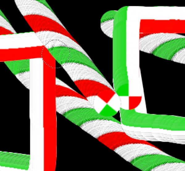
Here is the brush, there is no other colors, than white, red, green.

Load it as an image in GIMP
Ctrl + A then Ctrl + C
Create new doc then Select that brush (Clipboard Image, first in the brush list)
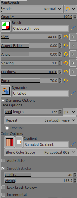
Spacing 1
Force 70

Make a square....
do you got some black stripes?
Even worse...
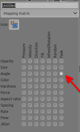
Try Dynamics / Untitled > Edit dynamics check "angle with Fade"

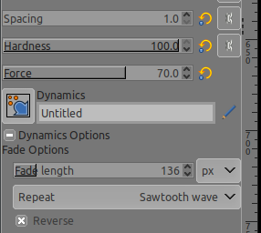
Fade length ~100
Repeat > Sawtooth wave (or any repeat will do)

Make a square...
Is it only me getting those black things?

So I tried to save it as a brush.gbr and put it in the brushes folder => same things happening
I tried also to select without feather =0 > shrink 3 pixels
same thing is happening but sharper....
And if you change the size of the brush (like smaller) it's even worse than above
Patterns that I saw (it's more obvious with dynamics):
drawing right to left is better (less black)
drawing bottom to top is better (less black)
drawing left to right is the worst
drawing top to bottom is the worst as well
reducing Force below 30 have a better effect, (less black parasites) but the candy alike is not sharp enough anymore > and goes on the blur side...
I'm getting out of ideas...
buntu 20.04, GIMP 2.10.24/25 PPA/appimage
did try also on my kid computer > MX Linux 19.4 GIMP from the original repo (Debian) 2.10.24, same problem
Load it as an image in GIMP
Ctrl + A then Ctrl + C
Create new doc then Select that brush (Clipboard Image, first in the brush list)
Spacing 1
Force 70
Make a square....
do you got some black stripes?
Even worse...
Try Dynamics / Untitled > Edit dynamics check "angle with Fade"
Fade length ~100
Repeat > Sawtooth wave (or any repeat will do)
Make a square...
Is it only me getting those black things?
So I tried to save it as a brush.gbr and put it in the brushes folder => same things happening
I tried also to select without feather =0 > shrink 3 pixels
same thing is happening but sharper....
And if you change the size of the brush (like smaller) it's even worse than above
Patterns that I saw (it's more obvious with dynamics):
drawing right to left is better (less black)
drawing bottom to top is better (less black)
drawing left to right is the worst
drawing top to bottom is the worst as well
reducing Force below 30 have a better effect, (less black parasites) but the candy alike is not sharp enough anymore > and goes on the blur side...
I'm getting out of ideas...
buntu 20.04, GIMP 2.10.24/25 PPA/appimage
did try also on my kid computer > MX Linux 19.4 GIMP from the original repo (Debian) 2.10.24, same problem


