10-03-2017, 04:05 PM
(This post was last modified: 10-04-2017, 07:28 AM by justusr846.)
Hey guys,
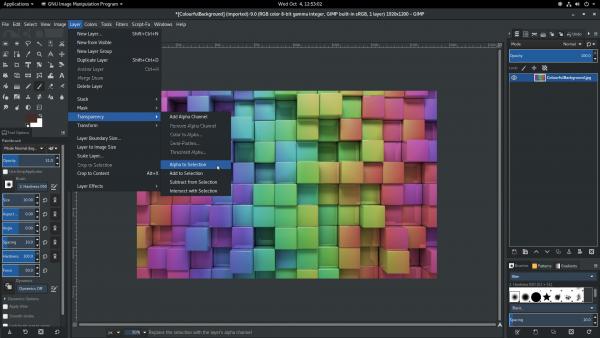
This is a dark theme based on the Advaita Dark theme for GNOME. I modified the gtkrc file (with a lot of trial and error) and merged files from Advaita and the default 'Dark' theme to get this. It was made with GIMP 2.97, so I'm not sure it works with older versions.

It was made as a standalone because using Advaita Dark as the system theme interferes with other applications, like the browser etc.
Download the theme file here:
 Advaita Dark GIMP Theme.zip (Size: 160.29 KB / Downloads: 2,067)
How to install (for newbies),
Extract the file to the 'themes' folder within GIMP.
Then open GIMP, Go to Edit --> Preferences --> Themes --> Advaita Dark
There are still a couple of things I noticed that needed fixing, but I haven't figured out how to solve them yet. Like...
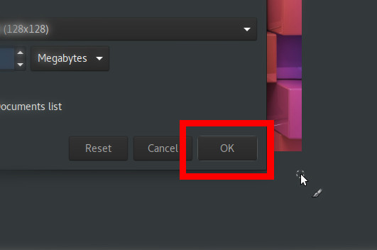
This outline that comes around the recently accessed button.

The system theme based outline color around the panels (which I think would be better if it was something dark)

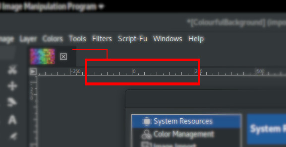
...and to match the color of the ruler to the tab.

Also I don't know if any better dark themes are available.... and all this might be irrelevant. ^_^
Updates:
4/10/2017 - Theme file replaced. (Updated the scrollbar)
This is a dark theme based on the Advaita Dark theme for GNOME. I modified the gtkrc file (with a lot of trial and error) and merged files from Advaita and the default 'Dark' theme to get this. It was made with GIMP 2.97, so I'm not sure it works with older versions.
It was made as a standalone because using Advaita Dark as the system theme interferes with other applications, like the browser etc.
Download the theme file here:
 Advaita Dark GIMP Theme.zip (Size: 160.29 KB / Downloads: 2,067)
How to install (for newbies),
Extract the file to the 'themes' folder within GIMP.
Then open GIMP, Go to Edit --> Preferences --> Themes --> Advaita Dark
There are still a couple of things I noticed that needed fixing, but I haven't figured out how to solve them yet. Like...
This outline that comes around the recently accessed button.
The system theme based outline color around the panels (which I think would be better if it was something dark)
...and to match the color of the ruler to the tab.
Also I don't know if any better dark themes are available.... and all this might be irrelevant. ^_^
Updates:
4/10/2017 - Theme file replaced. (Updated the scrollbar)


