Posts: 2
Threads: 1
Joined: Jun 2020
Reputation:
0
Gimp version:
Operating system(s): Windows (Vista and later)
Hi. I'm sorta new using GIMP. I've run into an issue that I was hoping someone with more experience could shed some light on. I am trying to curve text to a circle. This has worked excellent until recently. I am running GIMP 2.10.20 on a Windows 10 64-bit machine. I'm 1) creating a circle, 2) select to path, 3) creating the text (Sans-Serif, 29 px) and 4) text along path. Changing font doesn't seem to help much. Any suggestions or answers as to why this is happening is welcome.
Thx,
Gary J.

Posts: 7,955
Threads: 169
Joined: Oct 2016
Reputation:
1,089
Gimp version:
Operating system(s): Linux
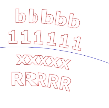
Very strange, with older versions of Gimp you could get that sort of effect if the path was a little too short. That does not look the case from your screenshot.
This a Gimp 2.10.20 (linux) and replicated your path and scale (29 px text) as best I could.

Text with default spacing is ok
Text with reduced character spacing, which I thought might be the problem is reasonable
Text with adjusted line spacing to bring the 11111 closer to the path more in line with your screenshot, OK
Can you post a Gimp xcf (or xcfgz) with the path(s) and text layer. that might give a clue.
Just a comment, multi line text is never a good idea. separate text and separate paths is the way although maybe Ofnuts text along path plugin might handle that. (lose some text formatting options though)
Posts: 117
Threads: 23
Joined: May 2017
Reputation:
7
Gimp version:
Operating system(s): Windows (Vista and later)
I would say that the trouble lies in the 'circle' path: though my eyesight isn't what it once was, I see a 'bump' more or less between the second and third '1', counting from the left. I would try with a fresh circular path...
Posts: 6,950
Threads: 297
Joined: Oct 2016
Reputation:
605
Gimp version:
Operating system(s): Linux
(06-26-2020, 08:48 PM)carmen Wrote: I would say that the trouble lies in the 'circle' path: though my eyesight isn't what it once was, I see a 'bump' more or less between the second and third '1', counting from the left. I would try with a fresh circular path...
Right on the spot.
Posts: 6,950
Threads: 297
Joined: Oct 2016
Reputation:
605
Gimp version:
Operating system(s): Linux
(06-26-2020, 07:32 PM)gary742 Wrote: Hi. I'm sorta new using GIMP. I've run into an issue that I was hoping someone with more experience could shed some light on. I am trying to curve text to a circle. This has worked excellent until recently. I am running GIMP 2.10.20 on a Windows 10 64-bit machine. I'm 1) creating a circle, 2) select to path, 3) creating the text (Sans-Serif, 29 px) and 4) text along path. Changing font doesn't seem to help much. Any suggestions or answers as to why this is happening is welcome.
See above for the direct solution to your problem.
A completely different solution is to use my ofn-text-along-path script. Unlike the original TaP algorithm, that move ancors one by one and distortss letters, my own moves/tilts characters as a whole so they are never distorted. Italso feature a lot of functionality that makes producing curverd text a lot easier that with the original Gimp function.
See here for details and examples.
Posts: 7,955
Threads: 169
Joined: Oct 2016
Reputation:
1,089
Gimp version:
Operating system(s): Linux
(06-26-2020, 07:32 PM)gary742 Wrote: ...snip... I'm 1) creating a circle, 2) select to path,....
Maybe the question should be. How is the circle created ?
Posts: 2
Threads: 1
Joined: Jun 2020
Reputation:
0
Gimp version:
Operating system(s): Windows (Vista and later)
(06-26-2020, 08:25 PM)rich2005 Wrote: Very strange, with older versions of Gimp you could get that sort of effect if the path was a little too short. That does not look the case from your screenshot.
This a Gimp 2.10.20 (linux) and replicated your path and scale (29 px text) as best I could.
Text with default spacing is ok
Text with reduced character spacing, which I thought might be the problem is reasonable
Text with adjusted line spacing to bring the 11111 closer to the path more in line with your screenshot, OK
Can you post a Gimp xcf (or xcfgz) with the path(s) and text layer. that might give a clue.
Just a comment, multi line text is never a good idea. separate text and separate paths is the way although maybe Ofnuts text along path plugin might handle that. (lose some text formatting options though)
Thanks Rich for your reply. I had not saved the previously attached file, but I recreated another going from memory. Got similar results. You are correct, there is shortened line spacing. Anyway, find attached xcf you requested.
BTW, circle was created by creating a file, putting in vert and horiz guides, eclipse from center (specifying horiz on vert dimension) and finally select to path. Then text along path.
Also, I sorta blew it as I was only using 2 lines when I found the issue, but when I put together the example I wasn't thinking and created 4 lines. But point taken, only curve one line for best results.
In another reply to my post, Carmen noticed a slight bump. Given how I created the circle, I'm not sure how that bump got there, maybe it's just a resolution nit. Dunno.
Thx, all
 distorted text along path.xcf
 (Size: 53.12 KB / Downloads: 385)
Posts: 7,955
Threads: 169
Joined: Oct 2016
Reputation:
1,089
Gimp version:
Operating system(s): Linux
06-27-2020, 03:34 PM
(This post was last modified: 06-27-2020, 04:17 PM by rich2005.
Edit Reason: lots of edits
)
Thanks for the file, that really helped.
From observation, not the 16 bit depth, or the font, or the -2 line spacing. It is the center-justification. Edit: Or maybe not, just tried in a Gimp 2.8, same distortion left -justify or center-justify. A mystery.
Looks like it is the path, this using a script to generate the circular path, the new path active (red) over original (blue)

There is another solution. One of ofnuts many plugins ofn-remove-tangents. Applied that gives a new 'Cleaned' path (works here)
same place as the ofn-text-along-path plugin http://sourceforge.net/projects/gimp-pat...s/scripts/
and while you are there try the ofn-path-to-shape plugin for really good circular paths.
Posts: 117
Threads: 23
Joined: May 2017
Reputation:
7
Gimp version:
Operating system(s): Windows (Vista and later)
(06-27-2020, 03:34 PM)rich2005 Wrote: ...
There is another solution. One of ofnuts many plugins ofn-remove-tangents. Applied that gives a new 'Cleaned' path (works here)
same place as the ofn-text-along-path plugin http://sourceforge.net/projects/gimp-pat...s/scripts/
and while you are there try the ofn-path-to-shape plugin for really good circular paths.
Sorry, Rich, but generally speaking, I doubt very much that ofn-remove-tangents would improve matters in this situation (see *): as a matter of fact, in the path of this example, most of the anchors causing the problem haven't any tangents already.
What one really needs is (few) 'smooth anchors'--i.e., those with tangents ('handles') in a straight line: so, ofn-path-to-shape. In this case, with the guides in place, a circle from diameter or radius...
(*) Simple experiment:
- create a 'good' circular path (ofn plugin) and put some text on it, with Gimp default 'text along path'
- stroke the circular path 1px, and, using that as a guide, create a poligonal path with 4 or more anchors, ample for your text
- put your text on this new path, and compare results: (a) when one of the anchors falls inside a character, or (b) inside the space between characters.
One of my problems when putting text on paths for a map (i.e., 'Something River' along a river) is to make the path smooth enough for a decent text--and this applies also to ofn-text-along-path.
Posts: 7,955
Threads: 169
Joined: Oct 2016
Reputation:
1,089
Gimp version:
Operating system(s): Linux
06-27-2020, 07:44 PM
(This post was last modified: 06-27-2020, 08:09 PM by rich2005.)
Well carmen, It does improve it. Although enlarged it does still have defects.

Of course the solution is a better original path, ofnuts plugin or even the old shape-path script
And a better solution in this case - do not use blocks of text with line breaks - use single lines of text.
So I will bow to your superior knowledge. Just going to try your simple experiment, looks interesting. So does your problem of text for a map.
As an old civil engineer, always had an interest in maps. Just had to pull up a UK OS map to see how they do it. Must have the same problem, not curved. Although in other names there is a change of direction between words.

edit: As you wrote, tracing a (short) 2 control point path gives a good result.

|


