Thread Rating:
  • 0 Vote(s) - 0 Average
  • 1
  • 2
  • 3
  • 4
  • 5
Font looks slightly dififerent in GIMP
#1
Hi everyone,
I was using this custom font and I came to notice for some reason it is slightly different from what it's supposed to look like, and this only happens in GIMP. I think the letters and other characters are slightly different too, but it really isn't noticeable, but what IS noticeable and has been bothering me is the period for some reason looking like a comma, which isn't supposed to happen
Here are the pics of the font in gimp and how it should actually look:
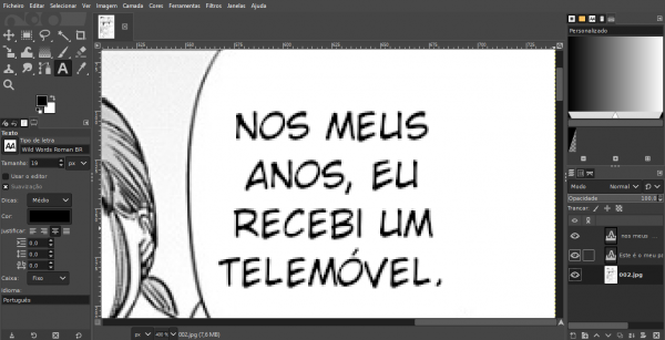
       

Once again, I've tested it on multiple programs, and GIMP was the only one to display it like this... any fix? I really can't get over the period
Reply
#2
19 pixels at 400%, thing is not gonna look good


bigger writing at 100%


Having said that while searching for this font I came with different downloads, some just 1 ttf some 3 ttf, and so on, but all with the "CC" in front of the name.
If you put your font in a zip and upload it here, we could try it.

as for the period, it's an extended point like a little comma, looks like an ellipse at "normal size", thus more like a little comma at extremely tiny size

   
Patrice
Reply
#3
(08-28-2024, 01:21 AM)Lafflesia Wrote: Hi everyone,
I was using this custom font and I came to notice for some reason it is slightly different from what it's supposed to look like, and this only happens in GIMP. I think the letters and other characters are slightly different too, but it really isn't noticeable, but what IS noticeable and has been bothering me is the period for some reason looking like a comma, which isn't supposed to happen
Here are the pics of the font in gimp and how it should actually look:


Once again, I've tested it on multiple programs, and GIMP was the only one to display it like this... any fix? I really can't get over the period

Two things:
  • At small sizes some features of a font can be adjusted for readability. This is called "hinting", and the font file defines what should be done (this is not Gimp doing this on its own). The Text tool has an option to set the amount of hinting that you want.
  • To make the text look nicer, modern system use sub-pixel rendering, that makes the text rendering depend on its actual position on the screen (and its color) and also slightly alters the shape. Gimp cannot use this because the text can be moved or its color changed once it has been rendered, and this optimization would turn into a "pessimization".
Reply
#4
(08-28-2024, 01:21 AM)Lafflesia Wrote: ....snip ...but what IS noticeable and has been bothering me is the period for some reason looking like a comma, which isn't supposed to happen.....
.....Once again, I've tested it on multiple programs, and GIMP was the only one to display it like this... any fix? I really can't get over the period

Not easy to comment on the comma / period differences except using a 19 pix character size reduces the period to a couple of pixels.

You have the commercial version of the font, I can only get the 'free-ish' version CCWild which is probably different. 

quote from freefont - The WILD WORDS ROMAN font appearance may differ based on the selected letters. Certain fonts may not support special characters or were designed for specific purposes.

You could get the font editor Fontforge and have a look inside the font for different versions of the character, Gimp might be picking up the wrong one. In the free version CCwild the period is just as you say, 

   
Reply
#5
Alright, indeedy the hinting seemed to have worked! Despite it supposedly being for making text more defined at smaller sizes it still looks perfectly good and the period looks like I wanted it to now.
Thank you everyone!
Reply


Forum Jump: