Posts: 117
Threads: 23
Joined: May 2017
Reputation:
7
Gimp version:
Operating system(s): Windows (Vista and later)
I wanted to add 'sea currents' to a map, as in the figure:
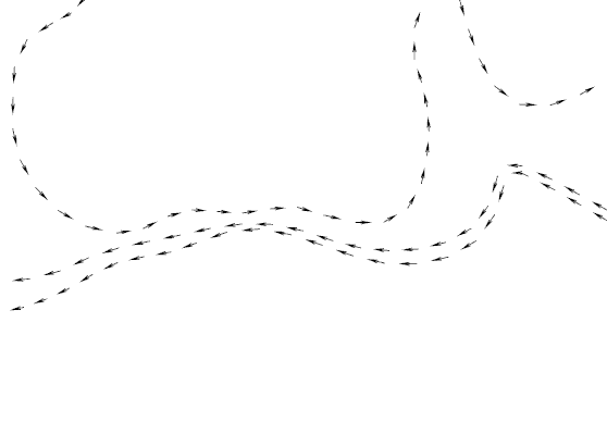
It could be done in Inkscape through 'markers', but I wanted it as a purely 'stroke path'--better for small, indexed images.
As can be seen, I succeeded trough the following steps:
- oriented paths made in Gimp
- export them to svg, and open in Inkscape
- Inkscape Extensions -> Modify Paths -> Add Nodes... -> By max. segment length = 30.0px
- import the modified paths into Gimp, and:
- * ofn-path-edits -> Disjoin strokes
- * ofn-path-to-shape -> Functions on segments -> Modify segments -> Start=0, End=50
- * manually edit 2 of the segments in the resulting paths (it should be evident which ones would need adjusting)
- * path-arrow-heads at ends...
In view of the results, I think that the 'Add Nodes to Path' would be a likely addition to the Gimp path toolbox (  do you hear, Ofnuts?). Besides the use above and its variants, it also can improve the result of ofn-bend-path for squarish fonts with few control points--enabling still more "Bendiness" (I have a 'borderline' example somewhere).
Posts: 851
Threads: 11
Joined: Oct 2016
Reputation:
89
Gimp version:
Operating system(s): Windows (Vista and later)
Posts: 117
Threads: 23
Joined: May 2017
Reputation:
7
Gimp version:
Operating system(s): Windows (Vista and later)
(06-20-2020, 02:11 PM)Blighty Wrote: See this thread:
https://www.gimp-forum.net/Thread-a-few-...ong-a-path
Yes--but when your images are e-pub illustrations (no sense to make them more than ~600px in each direction--they get resized by 'user agent') pure paths look better IMHO. Moreover, I liked in my example the 'custom dashes' that result from resizing the segments: their lenght is (basically, barring miters) independent from the stroke width. Also, instead of adding arrowheads, one can i.e., use ofn-paths-shapes to put a circle in each segment--thus, 'custom dots'...
Posts: 6,561
Threads: 285
Joined: Oct 2016
Reputation:
576
Gimp version:
Operating system(s): Linux
I don't like the idea of adding anchors at fixed distances. Paths are basically size-less things. I do have an algorithm to add anchors halfway between current anchors to increase the path "accuracy" (or more accurately, its resilience to mistreatment). It can of course be applied a few more times to divide segments by 2, 4, 8, 16...
As to your sea currents, I would solve that with a totally different script of mine: ofn-tex-along-path (using repeated layout) with an arrow symbol (large choice to cut/paste from here)(*) as the text:
(*) There is a huge set of symbols in the Unicode standard. It also contains emojis now so you can use ofn-tex-along-path to make a crown of poop emojis or a heart of dog heads...
Posts: 117
Threads: 23
Joined: May 2017
Reputation:
7
Gimp version:
Operating system(s): Windows (Vista and later)
06-20-2020, 11:41 PM
(This post was last modified: 06-21-2020, 12:22 AM by carmen.
Edit Reason: Add example
)
[attachment=4565 Wrote:Ofnuts pid='18808' dateline='1592692532']I don't like the idea of adding anchors at fixed distances. Paths are basically size-less things. I do have an algorithm to add anchors halfway between current anchors to increase the path "accuracy" (or more accurately, its resilience to mistreatment). It can of course be applied a few more times to divide segments by 2, 4, 8, 16...
As to your sea currents, I would solve that with a totally different script of mine: ofn-tex-along-path (using repeated layout) with an arrow symbol (large choice to cut/paste from here)(*) as the text:
(*) There is a huge set of symbols in the Unicode standard. It also contains emojis now so you can use ofn-tex-along-path to make a crown of poop emojis or a heart of dog heads...
- Yes--I like the notion of the text-along-path--going to try for the arrows. The only (possible) problem: I would need a quite small font-size: 1/2 of your example or less: used sometimes with stars and the like, and they are not so good at small sizes. Unfortunately, I don't know of a 'stroke font' with full unicode range--or at least symbols.
- The idea of inserting anchors every 'x' px is, in my opinion, only a means of inserting them at approximately regular intervals: 'x+'/'x-' to increase/decrease the intervals. As the original anchors are kept, the distance cannot be exact, anyway--I see it as 'split regularly...' -> 'no, too many/few splits--let's change the value...'. As a matter of fact, I have used the Inkscape 'Add nodes to paths...' to insert markers: of course, one could use instead 'shape along path -> repeated' (equivalent in many ways to your text along path), but the markers are controllable by adding/deleting intermeadiate nodes, so IMHO is good to have both options.
Anyway, the choice boils down to 'fill' versus 'stroke': for a map not larger than 600px any way, I always prefer 'stroke'--it's a personal preference.
Here is the the result of 'ofn-text-along-path(multi)' with the arrow at 12px and the same paths as in my first attachment, previous to split:
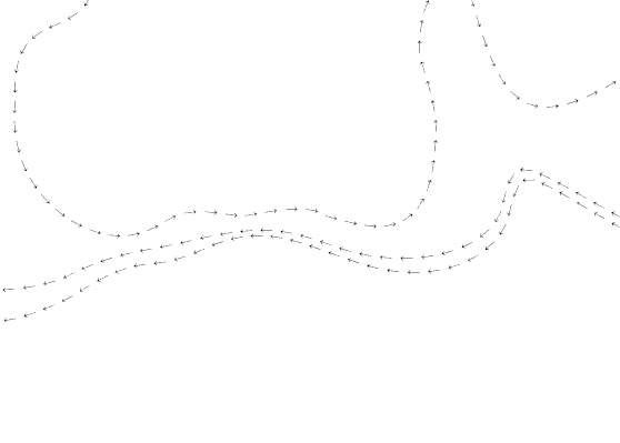
The problem with font size is apparent: for a fair result, one must (a) duplicate the layer (the path is filled on transparent background) or (b) stroking, besides filling or (c ) use a bold font: all these methods give a coarser result than the simple stroking in my original example...
Posts: 6,561
Threads: 285
Joined: Oct 2016
Reputation:
576
Gimp version:
Operating system(s): Linux
(06-20-2020, 11:41 PM)carmen Wrote: Here is the the result of 'ofn-text-along-path(multi)' with the arrow at 12px and the same paths as in my first attachment, previous to split:
The problem with font size is apparent: for a fair result, one must (a) duplicate the layer (the path is filled on transparent background) or (b) stroking, besides filling or (c ) use a bold font: all these methods give a coarser result than the simple stroking in my original example...
There are thin and thick arrows in the Unicode set, and it may of course depend on the actual font (though I suspect that on a given system few fonts carry these symbols and most will default to the same font).
In other news, I have added a "Densify anchors" function in ofn-path-edits.
Posts: 117
Threads: 23
Joined: May 2017
Reputation:
7
Gimp version:
Operating system(s): Windows (Vista and later)
(06-21-2020, 03:35 PM)Ofnuts Wrote: There are thin and thick arrows in the Unicode set, and it may of course depend on the actual font (though I suspect that on a given system few fonts carry these symbols and most will default to the same font).
How right you are! Windows, for instance, at most will use the same font for all serif and another for all sans--unless the font in question happens to provide the glyph, which nearly none do...
Quote:...
In other news, I have added a "Densify anchors" function in ofn-path-edits.
Just about to try it, to redo my first example. But first, a VERY BIG THANK YOU for all your work.
Posts: 117
Threads: 23
Joined: May 2017
Reputation:
7
Gimp version:
Operating system(s): Windows (Vista and later)
Well-- Edit -> Densify anchors won't answer for my initial example--the image should show why.
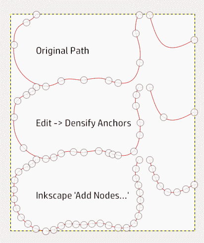
However, it does work for my 'borderline' bent text, as shown in this other example:
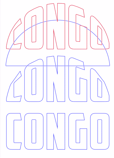
Bottom: Original text
Center: bent straightaway
Top: bent after densifying once. Behind this, not showing in the capture, is the result after Inskcap 'Add nodes...': the differences in the path are truly minimal, but as either needs further editing, 'Densify anchors' gives a more workable result: fewer anchors to deal with...
(And, of course, the semicircle--2 disjoint strokes--is the 'bender path'.)
Posts: 6,561
Threads: 285
Joined: Oct 2016
Reputation:
576
Gimp version:
Operating system(s): Linux
06-21-2020, 08:50 PM
(This post was last modified: 06-21-2020, 08:50 PM by Ofnuts.)
If you want more accuracy, you can apply Densify Anchors several times, for 2x, 4x, 8x anchors...
|

 do you hear, Ofnuts?). Besides the use above and its variants, it also can improve the result of ofn-bend-path for squarish fonts with few control points--enabling still more "Bendiness" (I have a 'borderline' example somewhere).
 do you hear, Ofnuts?). Besides the use above and its variants, it also can improve the result of ofn-bend-path for squarish fonts with few control points--enabling still more "Bendiness" (I have a 'borderline' example somewhere).


