Thread Rating:
  • 0 Vote(s) - 0 Average
  • 1
  • 2
  • 3
  • 4
  • 5
How To Write/Modify Text Totally Hinted (to look old)
#1
Question 
How To Write/Modify Text Totally Hinted (to look old)

Hello everyone  Smile

I guess, at some point in our lives, everyone is going to need to write text, to match imaged 'old text'.
IE. The text is in the image ... it looks great at viewing level, but when zoomed in, the pixel values run from light (at the outskirt) to dark (at the center).

Well; for me, that moment has arrived  Big Grin

Check out the viewed text:
   

Here is a zoomed view:
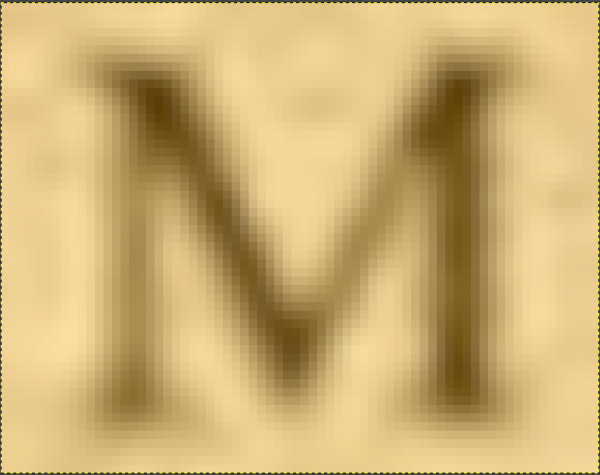
   

Adding text in Gimp (fully hinted):

   

The problem Is:
When adding new text to the document; it just doesn't match
... it sticks out like a sore thumb  Big Grin

Selecting a custom colour helps; as does reducing layer opacity
... but neither gets to the heart of the problem.

I'm thinking (hoping)...
that this issue has been met, and dealt with, by other members of the gimp community.
... and if so; I'd love to benefit from your experience.

Smile
Reply
#2
(03-26-2022, 12:42 AM)marco-gimp Wrote: How To Write/Modify Text Totally Hinted (to look old)

Hello everyone  Smile

I guess, at some point in our lives, everyone is going to need to write text, to match imaged 'old text'.
IE. The text is in the image ... it looks great at viewing level, but when zoomed in, the pixel values run from light (at the outskirt) to dark (at the center).

Well; for me, that moment has arrived  Big Grin

Check out the viewed text:


Here is a zoomed view:


Adding text in Gimp (fully hinted):


The problem Is:
When adding new text to the document; it just doesn't match
... it sticks out like a sore thumb  Big Grin

Selecting a custom colour helps; as does reducing layer opacity
... but neither gets to the heart of the problem.

I'm thinking (hoping)...
that this issue has been met, and dealt with, by other members of the gimp community.
... and if so; I'd love to benefit from your experience.

Smile

Did you tried to blur your new text to make it looks as bad as the first image where it's written "woman"?
You can also degrade your text with the filter Pixelize, go to Filters ➤ Blur ➤ Pixelize... set the block around 3 for your 1st image (or fine tune as you wish)
Or you can blur (Filters ➤ Blur ➤ gaussian blur) it first, then pixelize, for a better "transition" Wink

   
Reply
#3
A 2.5 Gaussian blur is similar. Depends what you are creating but for a match of the background, a section re-synthesized to make a tilable pattern.

   
Reply
#4
(03-26-2022, 08:06 AM)PixLab Wrote: Did you tried to blur your new text to make it looks as bad as the first image where it's written "woman"?
You can also degrade your text with the filter Pixelize, go to Filters ➤ Blur ➤ Pixelize... set the block around 3 for your 1st image (or fine tune as you wish)
Or you can blur (Filters ➤ Blur ➤ gaussian blur) it first, then pixelize, for a better "transition" Wink
(03-26-2022, 08:30 AM)rich2005 Wrote: A 2.5 Gaussian blur is similar. Depends what you are creating but for a match of the background, a section re-synthesized to make a tilable pattern.

Thanks chaps, for pointing me in the direction of blur and pixelize
... and that tileable pattern suggestion, is a timely reminder (that I needed)  Smile

I'm on it today. Blur
Reply
#5
Thumbs Up 
Not only success; but I have discovered the winning technique to create old style pixelized text. 
... and it is a definitive share - thoroughly unforgettable!

I first entered the text, selected by colour, and the ran rich2005's suggestion Gaussion Blur @ 2.5, followed by PixLab's suggestion of Pixelize @ block 3.

In order to improve the viewed result, layer Opacity was set to 90%.
... and this seemed acceptable.
It was not a perfect match, but it was acceptable, given the context.
However, it was clear that in some contexts, the result would be out of place.

Serendipity then played her card.

I typed some much smaller text, and I noticed that it was already pixelated,
Hmmm!
What would happen, if I scaled up the text? (I had a hunch).

I ran the text through the above procedure. and gained a minor improvement.
Then the text was again selected by colour, and copied & pasted as a new image.
The image was then scaled up by 2, using the scale tool.
(I've not tried Image Scale yet, but I'm guessing it will produce similar results)

This produced a mass of pixelization.

The new resized text image, was then loaded as a layer into the original image, to provide a densely pixelated text, that is no longer jagged.
Here is the result:

Pixelized Text Zoomed:
   

Pixelized Text As Viewed:
   

There is plenty of room for further experimentation, but the basic rule is simple:
Create larger text from smaller text!

Nice & easy  Big Grin

Re Creating the Paper (to write on)
I sampled a selection of the original (avoiding blotches).
This was converted to offset tiles - both pattern, and large image.

The result was obviously not great - basically, squares of the sample.
The Heal tool was used to clear an area, allowing the tool to be increased in size.
The image was then first healed to remove the tile intersections, and then randomly healed again (to remove any semblance of a pattern).

That worked very nicely.

What I will do, is create a large image of the paper/background as a resource.
This will allow me, in the future, to grab a background size, as per requirements.

Overall, a great days work.
Hopefully, it will also help others  Smile

Thanks again to rich2005 and PixLab, for sharing their knowledge  [Image: thumbsup.png] 
Reply
#6
(03-26-2022, 11:03 PM)marco-gimp Wrote: Overall, a great days work.
Hopefully, it will also help others  Smile

Thanks again to rich2005 and PixLab, for sharing their knowledge  [Image: thumbsup.png] 

Thanks to you for the thorough follow up, that was interesting to know how you did it.
Reply


Forum Jump: