Posts: 18
Threads: 4
Joined: Mar 2022
Reputation:
0
Gimp version:
So for anyone who needs a catch up on Supreme Court:
https://www.nytimes.com/2023/06/08/us/do...court.html
https://www.scotusblog.com/2023/06/jack-...s-dog-toy/
https://www.cnn.com/2023/06/08/politics/...index.html
https://www.npr.org/2023/06/08/118101295...s-decision
https://slate.com/human-interest/2023/06...g-toy.html
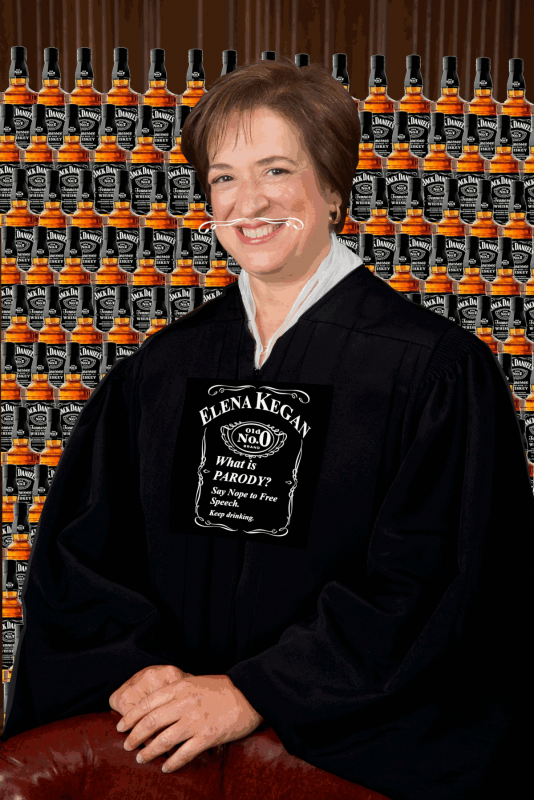
IDK, maybe you wondering why i picked this subject out of all the current issues right now with SCOTUS, but anyway this is what i did. Thoughts? (edit: file too big; i indexing+downsizing - max file size 500kb)

Posts: 1,538
Threads: 71
Joined: May 2021
Reputation:
167
Gimp version:
Operating system(s): Linux
06-10-2023, 05:27 AM
(This post was last modified: 06-10-2023, 05:33 AM by PixLab.)
Quote:It's funny i make this thing and then don't know where to post it?
Maybe search for r/scotus on reddit.
You could have post it in " Watercooler", but it's written no religion - no politic, thus here and there are the wrong forum as well
Um... 5 links about your SCOTUS / COCCUS / WHATNOTUS.. 
Anyway about your image, just my 2 cents, it's ugly > OK the indexation didn't help, but it's also badly made, there is no dimension and the bottle of scotch still have the white lining around it from the cut out, also the first bottle is doubled, um... better I stop here, I don't want to write a pamphlet if I start speaking about the personage, the dress, etc... 
Tip about posting image > You did not need to index that png > posting a jpg instead would have worked, we don't need a huge image, a 1000 pixels height would have been enough for that matter.
Posts: 18
Threads: 4
Joined: Mar 2022
Reputation:
0
Gimp version:
06-10-2023, 11:34 AM
(This post was last modified: 06-10-2023, 11:50 AM by TumbleRocks.)
Hey, thanks! jpg is way smaller - i guess that's why they call it lossy!
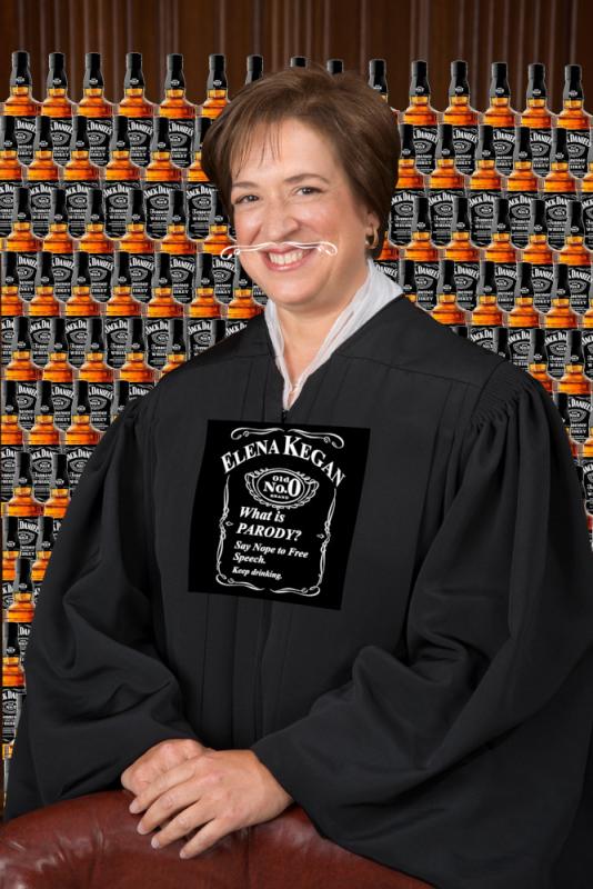
And you are definitely right about it being ugly, though i did try to do the cut out of Kegan reasonably carefully. Though it looks like i pasted the 1st bottle on top instead of behind while constructing my background. I up'ed the contrast on the gown to make it blend better with the logo in the 1st upload, and also to hopefully save a little detail in the face(I'm not sure i understand fully how the auto-index algorithm works. Also, it would be nice if i new an easy way to index separate layers and then combine.).
All-in-all i'm fairly happy with it for the amount of time i put into it.
Here is the original before i contrasted + indexed(downsized->jpg).
...i dont use reddit.
fyi, i don't drink.
ok, i do, but i shouldn't.
no one should.
Also, in case it isn't clear, everything is a screenshot/clipping - nothing is painted. I made the logo on here chest by altering the real logo, and then using cage transform under tools. i think it had roughly the desired effect.
Right, and about the bottles, if i really cared maybe i should have cut that one out manually, but i just used the fuzzy select tool and inverted. I can never figure that one out, but it takes so long to use paths manually.
i think that's it. not sure what else there is to say. Anyone else?
Posts: 1,538
Threads: 71
Joined: May 2021
Reputation:
167
Gimp version:
Operating system(s): Linux
06-10-2023, 05:46 PM
(This post was last modified: 06-10-2023, 05:48 PM by PixLab.)
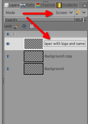
maybe put the layer of the logo/name above the dress in Screen Mode
Posts: 18
Threads: 4
Joined: Mar 2022
Reputation:
0
Gimp version:
06-10-2023, 08:47 PM
(This post was last modified: 06-10-2023, 08:50 PM by TumbleRocks.)
Now you're making me mad! graphic art shouldn't be so easy. 
fixed it:
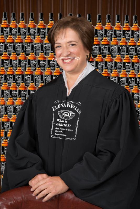
I can't fix anything else. the point was sort of to look like crap - but not total crap, so thanks!
Posts: 364
Threads: 41
Joined: Mar 2018
Reputation:
26
Operating system(s): Linux
No politics or religion is standard for forums. This appears to be about something 'legal' so it's should be OK.
The fact at least one SCOTUS judge has been bought should also make it 'commercial'. If you were posting about a SCOTUS judge who is for sale then that would be spam. This is the minefield posters to forums have to navigate in the 2020's.
Posts: 18
Threads: 4
Joined: Mar 2022
Reputation:
0
Gimp version:
06-18-2023, 11:30 PM
(This post was last modified: 06-19-2023, 07:45 AM by rich2005.)
It's probably worth including the actual SCOTUS opinion in this post: https://www.supremecourt.gov/opinions/22...8_3e04.pdf
Also, perhaps i maybe overlooked a little fact that this case is still not over, but has simply returned to the lower court to be reevaluated for it's merits.
And, you know, it's funny, after letting this sit for a week, i'm not sure i still agree with my first assessment. Actually, I'm not really sure how i feel about the whole Silly Squeakers business model. It one thing to make a single smelly dog parody of major liquor brand, and sell it for money - maybe even multiple smelly dog parodies of major boos brands. But it is another matter entirely, to make and sell a collection of different themed animal parodies of numerous major beverage brands(including non-alcoholic soda), not all of which seem to even present a critical/negative/poop-joke put down of the brand in question. In addition, some of the designs seem to even present a positive-to-neutral looking knockoff-mockups of a given brand's logo.
Looking into it more some of the parodies seem to be kind of half baked, and the message doesn't seem too consistent.
EDIT: Sorry too much adverting to let all that go - rich
Did i set the record straight? it's so hard to be a meme artist!
Posts: 7,277
Threads: 156
Joined: Oct 2016
Reputation:
1,014
Gimp version:
Operating system(s): Linux
06-19-2023, 07:51 AM
(This post was last modified: 06-19-2023, 10:02 AM by rich2005.
Edit Reason: maybe not
)
gimp-forum is not social media. The link to "...it's so hard to be a meme artist!..." stretches the boundaries of what is graphics.
Try and keep your posts to your 'memes' and really a better place might be such as .. reddit or similar.
SCOTUS ? I initially thought that was some sort of nasty skin complaint, but then I do not come from the USA.
Posts: 18
Threads: 4
Joined: Mar 2022
Reputation:
0
Gimp version:
Hey, sorry if i misunderstood the rules of the forum, but there was a tiny bit more to my argument you cut out. I just wanted to make clear that i don't really see anything wrong with the ruling at this point, and i want people to know that when viewing my mashup.
And maybe i didn't manage to actually distill a clear point in my previous comment, and maybe i rambled too long, though i think maybe now i am getting closer forming a thesis. Perhaps issue turns on is whether or not a spoof(or a collection of spoofs in this case) need(s) to present a consistent message in order to qualify as a legally protected parody? Or can you just spoof willy-nilly with no message or even with conflicting messages?
These are graphic designs. And i really don't want to argue, but it kinda discourages me from posting more if someones is going to edit and cut out large sections of my writing after the fact. Maybe you say i should bark up another tree, though I did make this in GIMP, and so i though it would be appropriate on that basis.
Anyway, i've got other things to go do. This is really something i just do in my spare time these days(and i seem to have less spare time).
So i guess moral of the story is to do your research before you GIMP.
And i guess i missed the mark on this one, but hey life goes on; it was a fun little exercise at least.
|
