Posts: 939
Threads: 93
Joined: Oct 2016
Reputation:
36
Gimp version:
Operating system(s): Windows (Vista and later)
05-14-2018, 01:41 PM
(This post was last modified: 05-14-2018, 01:53 PM by Espermaschine.)
I uploaded something new and it looks blurry.
My guess is, its because not all lines are 100% aligned to the pixel grid....
There is an extension in Inkscape called 'Pixel Snap' thats supposed to fix this, but i either get an error for the whole thing or when just trying to align the straight lines, its all messed up afterwards.
Is there a way to fix the png in Gimp ?
I tried a High Pass Filter but this seems to remove all the antialiased pixels and makes the lines jaggy.
Or is this simply a resolution problem ?
Posts: 301
Threads: 12
Joined: Oct 2016
Reputation:
16
Gimp version:
Operating system(s): Windows (Vista and later)
Which version do you think looks blurry?
The version as displayed on the page you linked-to? OR the version you get after clicking on the image?
The as-displayed looks blurry to me, but then it's been re-sized on the page to be 640x314 from it's original 895x440
Posts: 939
Threads: 93
Joined: Oct 2016
Reputation:
36
Gimp version:
Operating system(s): Windows (Vista and later)
05-14-2018, 02:12 PM
(This post was last modified: 05-14-2018, 02:14 PM by Espermaschine.)
(05-14-2018, 01:53 PM)Kevin Wrote: Which version do you think looks blurry?
Yes, the original is better, but the halftone gradient lines are still a bit blurry. So it is a resolution problem ?
I can see why its probably not possible to interpolate two lines at different intervals and align them perfectly to a pixelgrid.
Paths are math in the first place and a pixel is a physical limitation.
Posts: 939
Threads: 93
Joined: Oct 2016
Reputation:
36
Gimp version:
Operating system(s): Windows (Vista and later)
05-15-2018, 12:24 PM
(This post was last modified: 05-15-2018, 12:44 PM by Espermaschine.)
Im still not 100% sure i understand how to make this look good.
It seems it matters at what size i start building my artwork. For example 1px is the smallest unit my monitor can display, yet Inkscape is capable of creating a line that is 0.1 or 0,75px.
Obviously in the end it depends on the export size.
Does it make any difference at what size im uploading the image to my blog ?
Is way bigger better when downsized (because more information), or should i go with something that is roughly the same size ?
Posts: 6,514
Threads: 284
Joined: Oct 2016
Reputation:
572
Gimp version:
Operating system(s): Linux
Looks fine to me... (at least, the full size image). The border that fall on integer pixels are as sharp as can be. Of course the pseudo-gradient (or the stripes around the star) look a bit blurry, but this is a moiré that comes from a lack of definition (any regular pattern that is smaller that 3-4 pixels can cause this).
Posts: 939
Threads: 93
Joined: Oct 2016
Reputation:
36
Gimp version:
Operating system(s): Windows (Vista and later)
05-15-2018, 04:59 PM
(This post was last modified: 05-15-2018, 05:00 PM by Espermaschine.)
(05-15-2018, 04:17 PM)Ofnuts Wrote: Looks fine to me... (at least, the full size image). The border that fall on integer pixels are as sharp as can be. Of course the pseudo-gradient (or the stripes around the star) look a bit blurry, but this is a moiré that comes from a lack of definition (any regular pattern that is smaller that 3-4 pixels can cause this).
This still doesnt answer my question 100%.
I tried exporting the image in 1790x880px and compare it to the 895x440px which is currently uploaded to my blog. When i look at both images and zoom out (in an imageviewer called XnView), i get the feeling the bigger image looks less blurry.
Am i imagining this ?
Posts: 6,514
Threads: 284
Joined: Oct 2016
Reputation:
572
Gimp version:
Operating system(s): Linux
(05-15-2018, 04:59 PM)Espermaschine Wrote: (05-15-2018, 04:17 PM)Ofnuts Wrote: Looks fine to me... (at least, the full size image). The border that fall on integer pixels are as sharp as can be. Of course the pseudo-gradient (or the stripes around the star) look a bit blurry, but this is a moiré that comes from a lack of definition (any regular pattern that is smaller that 3-4 pixels can cause this).
This still doesnt answer my question 100%.
I tried exporting the image in 1790x880px and compare it to the 895x440px which is currently uploaded to my blog. When i look at both images and zoom out (in an imageviewer called XnView), i get the feeling the bigger image looks less blurry.
Am i imagining this ?
Hard to tell. That could mean that the scaling algorithm XnView uses when you zoom introduces some blur (they all do...) or scaling artifacts.
TLDR; if you don't look at the image dot-for-dot you can't really tell.
Posts: 939
Threads: 93
Joined: Oct 2016
Reputation:
36
Gimp version:
Operating system(s): Windows (Vista and later)
05-15-2018, 11:16 PM
(This post was last modified: 05-15-2018, 11:17 PM by Espermaschine.)
Here is an image i made.
Circle on the left has a strokewidth of 1px.
Circle on the right has a strokewidth of 0,1px.
Circle in the middle has a strokewidth of 0,5px.
How is this even possible ?

Posts: 6,514
Threads: 284
Joined: Oct 2016
Reputation:
572
Gimp version:
Operating system(s): Linux
05-16-2018, 12:37 PM
(This post was last modified: 05-16-2018, 12:38 PM by Ofnuts.)
(05-15-2018, 11:16 PM)Espermaschine Wrote: Here is an image i made.
Circle on the left has a strokewidth of 1px.
Circle on the right has a strokewidth of 0,1px.
Circle in the middle has a strokewidth of 0,5px.
How is this even possible ?
- Assume you have a 10x10 square filled with white. Let's say its average luminosity is 1.
- Stroke over it a 5px-wide black line. Half the pixels will be black, and the average luminosity will be .5
- Now do the same with a 1px square (one pixel). If it is stroked over by a .5px line, its luminosity should be .5, too, so you can fill it it with a gray with a luminosity of .5
- In practice you can evaluate the area of a pixel covered by the stroke, and thus figure out the equivalent gray. This of course also holds for the edge/anti-aliasing pixels.
In reality things are a bit different, its more a matter of partial opacity than of luminosity, and the gamma correction can make the result non-linear.
Posts: 939
Threads: 93
Joined: Oct 2016
Reputation:
36
Gimp version:
Operating system(s): Windows (Vista and later)
05-16-2018, 01:20 PM
(This post was last modified: 05-16-2018, 01:20 PM by Espermaschine.)
Yeah, i was tempted to say in my last post: it looks like somebody just decreased the opacity.
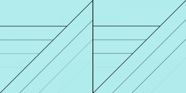
Did another experiment: left side has 2px, 1px, 0,5px and 0,1px strokewidth. There are some transparent pixels on the horizontal lines, although you could argue the 2 and 1px dont need them.
On the right after i applied pixelsnap. This reduces the transparency as expected.

I guess i understand now, how its possible to have the visual equvialent of a fracture of pixel lines.
Still not sure how to apply this to a future project.
|


