Thread Rating:
  • 0 Vote(s) - 0 Average
  • 1
  • 2
  • 3
  • 4
  • 5
T-shirt Mock Up
#1
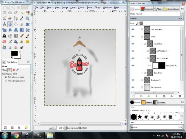
Hey everyone, this is my first post here and I'm hoping for some advice.. Months ago I downloaded a t-shirt mock up template to post online, I have tried many tutorials written and on Youtube over months to try and figure out how to actually get the t-shirt to show up, I just cannot figure it out. I'm running out of ideas how to figure this out anymore so thought I'd ask here.. Any ideas or a direction to point me in would be much appreciated.

I have attatched a screenshot
   
Reply
#2
This is a PhotoShop .psd template. PS .psd is a proprietary format that is only partially supported by Gimp, unlikely to work 100% (maybe 50 % if lucky)

You might be able to use parts for your use but it will take a bit of work on your part.

What does not work
If you look at the layers, some have a little '+' against them, these expand and often contain PS adjustment/effect layers that do not work.
What was editable text in PS is now a graphic layer. All you can do there is replace by a Gimp text layer.

What does work
Some of the graphics.

However you can learn much from the general format.

Layers to make visible, the little 'eye' icon toggles visibility on/off, will give either a front or a back.
Layers to fill with colour, to change the shirt colour.
Layers for various logos that might be used.

Remember to save your reconstruction as a Gimp .xcf file. This keeps all layers, Gimp text, layer masks for later editing.
Reply
#3
I could not find an exact match to the file shown but this is the type of template you might make in Gimp. Does not have the adjustment/effects/smart objects of PS but is workable.

[Image: s5uKrof.jpg]

1. Some of the details that can be edited and/or made visible.

2. This is where your design goes.
The layer does have a size 1000x1000 that can be changed but gives an idea of the size required. No good using some 100x100 pixel logo and up-scaling. It will look horrible. Two ways to get it in. Copy -> Paste -> Anchor or Import: File -> Open as Layers.

3. Want to change the colour, easy, bucket fill this layer. The blue one. (but not the mask)

4. Want a background, it goes here or toggle visibility off for transparency.

The PS templates tend to be huge. Slimmed down in Gimp still big. This one 17 MB (on dropbox for you to experiment with). A .xcf.gz that opens straight up in Gimp 2.8 https://www.dropbox.com/s/3e3k16ovtdfz77...cf.gz?dl=0

See if you can apply the concept to your template.

edit: I deliberately left out any drop-shadow layers. IMHO these are best left until the very end when the design is finished. Then a new-from-visible gets a combined layer. Use the drop shadow filter on it.
Reply


Forum Jump: