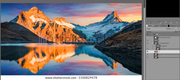
I gave it a try with it > https://www.shutterstock.com/image-photo...1500829478
Just because I don't like pixelated picture (it hurts my eyes)
I did it a different way than rich2005
I worked on the edges at the very end with the script resynth-along-path (3px width, pixels to take from 7 -> which is the minimum)
to start with, I did path the letter in the middle of the white part (edges), each letter its own path (just because I was testing, and I did it only on the "s" and the "h" just because I'm lazy .
.
Then path to selection, then Ctrl+C on the selected letter, => Ctrl+V > floating to new layer, that layer in "Addition mode" yep now the color looks very similar (just the outer edge are even brighter, but we don't care for now)
Merge down that letter layer to the image, then go on that letter path (in the path dock) right click on it, at the bottom you will got resynth along path, use the setting above (don't forget that the setting of the pugin are for the picture in the link above)
see the S disappeared (addition + edge resynth along path), see the "h" has the same lightness than the background/surrounding (did not resynth the "h", just layer in addition mode, the blue line you see is the path)

Just because I don't like pixelated picture (it hurts my eyes)
I did it a different way than rich2005
I worked on the edges at the very end with the script resynth-along-path (3px width, pixels to take from 7 -> which is the minimum)
to start with, I did path the letter in the middle of the white part (edges), each letter its own path (just because I was testing, and I did it only on the "s" and the "h" just because I'm lazy
 .
.Then path to selection, then Ctrl+C on the selected letter, => Ctrl+V > floating to new layer, that layer in "Addition mode" yep now the color looks very similar (just the outer edge are even brighter, but we don't care for now)
Merge down that letter layer to the image, then go on that letter path (in the path dock) right click on it, at the bottom you will got resynth along path, use the setting above (don't forget that the setting of the pugin are for the picture in the link above)
see the S disappeared (addition + edge resynth along path), see the "h" has the same lightness than the background/surrounding (did not resynth the "h", just layer in addition mode, the blue line you see is the path)


