01-15-2023, 09:40 AM
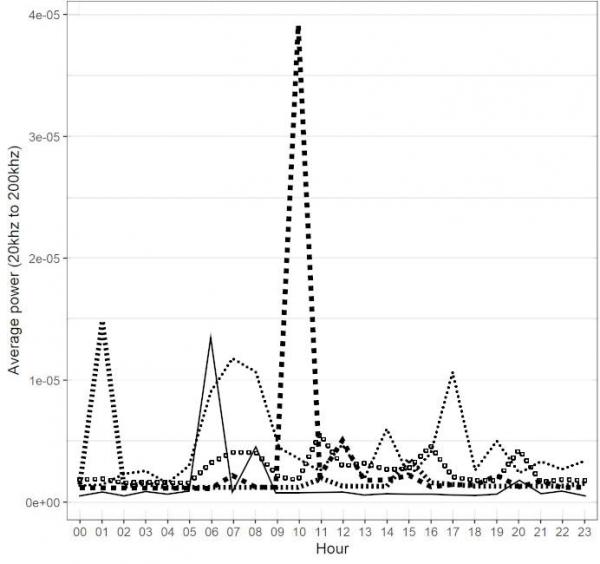
Converting to grayscale really makes the chart difficult to read.
Initially I thought of sorting by color and then applying strokes to each line (I think that's what you did).
In the copy I worked on, however, even when I tried to adjust the Threshold value, the selection had several interruptions in its continuity.
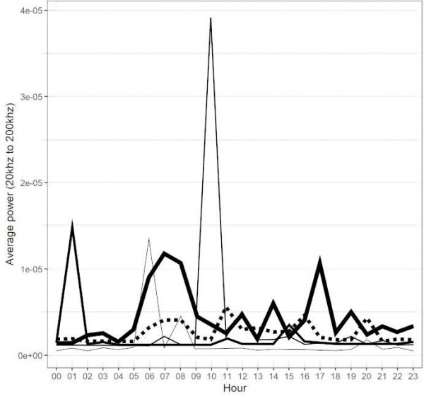
Creating paths seems to be a cleaner and easier option since it's just straight lines.
However, overlapping dotted lines does not give a good reading.

One option (maybe) is to just draw the lines with different thicknesses, and in just one of the 5 make a stroke (so as not to create a very thick line).

If there weren't so many overlaps between the graph lines, different dotted lines or even brushes created to customize the lines would be a good solution.
But definitely nothing like reading it on a colorful chart.
Initially I thought of sorting by color and then applying strokes to each line (I think that's what you did).
In the copy I worked on, however, even when I tried to adjust the Threshold value, the selection had several interruptions in its continuity.
Creating paths seems to be a cleaner and easier option since it's just straight lines.
However, overlapping dotted lines does not give a good reading.
One option (maybe) is to just draw the lines with different thicknesses, and in just one of the 5 make a stroke (so as not to create a very thick line).
If there weren't so many overlaps between the graph lines, different dotted lines or even brushes created to customize the lines would be a good solution.
But definitely nothing like reading it on a colorful chart.
.....
Samj Portable - Gimp 2.10.28 - Win-10 /64.
Samj Portable - Gimp 2.10.28 - Win-10 /64.


