06-10-2023, 11:34 AM
(This post was last modified: 06-10-2023, 11:50 AM by TumbleRocks.)
Hey, thanks! jpg is way smaller - i guess that's why they call it lossy!
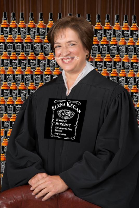
And you are definitely right about it being ugly, though i did try to do the cut out of Kegan reasonably carefully. Though it looks like i pasted the 1st bottle on top instead of behind while constructing my background. I up'ed the contrast on the gown to make it blend better with the logo in the 1st upload, and also to hopefully save a little detail in the face(I'm not sure i understand fully how the auto-index algorithm works. Also, it would be nice if i new an easy way to index separate layers and then combine.).
All-in-all i'm fairly happy with it for the amount of time i put into it.
Here is the original before i contrasted + indexed(downsized->jpg).
...i dont use reddit.

fyi, i don't drink.
ok, i do, but i shouldn't.
no one should.
Also, in case it isn't clear, everything is a screenshot/clipping - nothing is painted. I made the logo on here chest by altering the real logo, and then using cage transform under tools. i think it had roughly the desired effect.
Right, and about the bottles, if i really cared maybe i should have cut that one out manually, but i just used the fuzzy select tool and inverted. I can never figure that one out, but it takes so long to use paths manually.
i think that's it. not sure what else there is to say. Anyone else?
And you are definitely right about it being ugly, though i did try to do the cut out of Kegan reasonably carefully. Though it looks like i pasted the 1st bottle on top instead of behind while constructing my background. I up'ed the contrast on the gown to make it blend better with the logo in the 1st upload, and also to hopefully save a little detail in the face(I'm not sure i understand fully how the auto-index algorithm works. Also, it would be nice if i new an easy way to index separate layers and then combine.).
All-in-all i'm fairly happy with it for the amount of time i put into it.
Here is the original before i contrasted + indexed(downsized->jpg).
...i dont use reddit.
fyi, i don't drink.
ok, i do, but i shouldn't.
no one should.
Also, in case it isn't clear, everything is a screenshot/clipping - nothing is painted. I made the logo on here chest by altering the real logo, and then using cage transform under tools. i think it had roughly the desired effect.
Right, and about the bottles, if i really cared maybe i should have cut that one out manually, but i just used the fuzzy select tool and inverted. I can never figure that one out, but it takes so long to use paths manually.
i think that's it. not sure what else there is to say. Anyone else?


