11-07-2016, 09:46 PM
(This post was last modified: 11-07-2016, 11:55 PM by Espermaschine.)
Coming from this thread:
http://www.gimp-forum.net/Thread-80ies-c...435#pid435
There are several problems with making a perspective grid:
1. for a real perspective you'd have to set up a horizonline and a vanishing point, right ?
2. Also for a real perspective grid, the horizontal lines would need to get closer, the more distant they are.
The perspective tool in Gimp is not a real perspective tool. It doesnt follow any perspective rules, unlike Inkscape's perspective extension or LPE.
Gimp's perspective tool is just a sort of free transform.
So lets say we throw that out of the window and make a fake perspective grid instead.
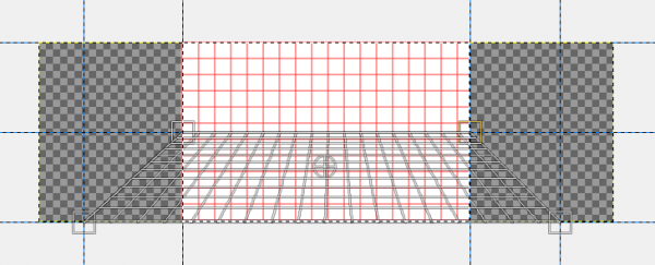
Im using a 640x400px canvas and with ofnuts' Path-grid plug-in, i set up a grid 36x36px.
I also set up guides around the edges of my canvas, and at 50% horizontally.

Heres the first problem:
i cant put guides outside the canvas, which i need as guidance and for snapping. If i want to stretch out the grid at the bottom, i have to extend the canvassize.
The perspective tool doesnt seem to give me any help with the coordinates.
So im setting up two additional guides 200px away from the edges of my original canvas after i extended my canvas.

Next problem: when i use the perspective tool in path mode, its applied to the whole canvas.
Im fixing that by alpha selecting my original canvas size.

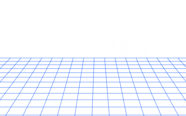
After i applied the fake perspective to my path grid, i stroke the path on a new transparent layer.

Comments ?
http://www.gimp-forum.net/Thread-80ies-c...435#pid435
There are several problems with making a perspective grid:
1. for a real perspective you'd have to set up a horizonline and a vanishing point, right ?
2. Also for a real perspective grid, the horizontal lines would need to get closer, the more distant they are.
The perspective tool in Gimp is not a real perspective tool. It doesnt follow any perspective rules, unlike Inkscape's perspective extension or LPE.
Gimp's perspective tool is just a sort of free transform.
So lets say we throw that out of the window and make a fake perspective grid instead.
Im using a 640x400px canvas and with ofnuts' Path-grid plug-in, i set up a grid 36x36px.
I also set up guides around the edges of my canvas, and at 50% horizontally.
Heres the first problem:
i cant put guides outside the canvas, which i need as guidance and for snapping. If i want to stretch out the grid at the bottom, i have to extend the canvassize.
The perspective tool doesnt seem to give me any help with the coordinates.
So im setting up two additional guides 200px away from the edges of my original canvas after i extended my canvas.
Next problem: when i use the perspective tool in path mode, its applied to the whole canvas.
Im fixing that by alpha selecting my original canvas size.
After i applied the fake perspective to my path grid, i stroke the path on a new transparent layer.
Comments ?


![[Image: rect4550.png]](https://3.bp.blogspot.com/-q3NDd9iUXok/V0DuHsLp4pI/AAAAAAAADK0/qoR9GeLTDM0m8c865QMZH_RbS3Z9qL_KACLcB/s1600/rect4550.png)