Posts: 251
Threads: 26
Joined: Feb 2019
Reputation:
13
Gimp version:
Operating system(s): Windows Vista or 7, 8, 10 (64-bit)
Linux
03-24-2021, 04:34 PM
(This post was last modified: 03-24-2021, 04:47 PM by rickk.)
Just wondering if I am overlooking something.
In the following sketch:
#1 is the pattern I am using,
#2 is an example of how I would like the final appearance of my stroked path, to appear
#3 is an example stroked path, depicting the misalignment that I am hoping to correct
#4 is where I believe my problem is, the pattern actually arranges itself in a symmetric grid, and the stroked path is merely a mask over it, or, perhaps another way to say it is that the path is not "content aware"?
Is there something I am missing that will force the painting of the pattern to follow within the confines of the path?
![[Image: YpyYCCb.png]](https://i.imgur.com/YpyYCCb.png)
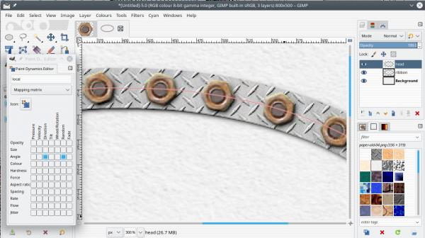
Ultimately, I'm hoping to find a way to do something like this, except curved along the specified path
![[Image: njblmqz.png]](https://i.imgur.com/njblmqz.png)
Thanks for your time.
Posts: 7,316
Threads: 156
Joined: Oct 2016
Reputation:
1,024
Gimp version:
Operating system(s): Linux
03-24-2021, 05:10 PM
(This post was last modified: 03-24-2021, 05:12 PM by rich2005.)
I think you would be better off separating the nut from the background. The background has a bit of a gradient, you might be able to create that some other way.
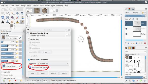
However. with the nut (transparent background) as a brush. Stroke the path using the paint tool and emulate dynamics. Spacing is a percentage so make it > 100
Add the background as a regular stroke path with FG colour (I erased a bit so you can see the nuts)

Posts: 251
Threads: 26
Joined: Feb 2019
Reputation:
13
Gimp version:
Operating system(s): Windows Vista or 7, 8, 10 (64-bit)
Linux
 03-24-2021, 06:00 PM
(03-24-2021, 05:10 PM)rich2005 Wrote: I think you would be better off separating the nut from the background. The background has a bit of a gradient, you might be able to create that some other way.
However. with the nut (transparent background) as a brush. Stroke the path using the paint tool and emulate dynamics. Spacing is a percentage so make it > 100
Add the background as a regular stroke path with FG colour (I erased a bit so you can see the nuts)
Thanks man! that's perfect. Brush dynamics is another one of those areas where I need to set aside some time, and just experiment to get a feel for. 
Posts: 6,562
Threads: 286
Joined: Oct 2016
Reputation:
576
Gimp version:
Operating system(s): Linux
Didn't see Rich's answer, but thinking among the same lines. Use a brush for the nuts, and another one for the metal under them. May I recommend the use of my ofn-brush-strokes-on-path script to have the nuts regularly spaced and evenly dividing your path. In the image below:
- The nut brush was obtained by making a small clip path around a nut, copying to the clipboard and using the clipboard brush in the script above. I asked the script for a 50px spacing and it figured out the 19 brush strokes.
- The "ring" was a 60px circle filled with a left-right gradient, from the darker color to the lighter one;copied to the clipboard and using the clipboard brush in Edit > Stroke path
 RingAndNuts.xcf
 (Size: 466.17 KB / Downloads: 226)
Posts: 251
Threads: 26
Joined: Feb 2019
Reputation:
13
Gimp version:
Operating system(s): Windows Vista or 7, 8, 10 (64-bit)
Linux
03-25-2021, 01:56 AM
(This post was last modified: 03-25-2021, 04:11 AM by rickk.)
(03-25-2021, 12:48 AM)Ofnuts Wrote: Didn't see Rich's answer, but thinking among the same lines. Use a brush for the nuts, and another one for the metal under them. May I recommend the use of my ofn-brush-strokes-on-path script to have the nuts regularly spaced and evenly dividing your path. In the image below:
I am appreciative to both of you for your attention, and efforts. Dabbling with the guidance Rich gave me earlier, but using a selection ellipse rather than an actual path.... got me here (the extra "fill" I just threw in to kill the stark white background):
![[Image: zC0OWQc.png]](https://i.imgur.com/zC0OWQc.png)
I found it interesting how the figure specified for brush spacing was crucial to closing the loop evenly so that the first and last bolts were spaced properly. Otherwise you ended up with either one pair that were different from all others, or worse case a pair that were "binoculared" . All in all I'm very pleased with the result. I'll probably go back and fine tune my "brush" image so that the shading isn't so directional, and yeah, getting rid of the surrounding area was definitely the way to go.
I'll give the script a try too. Thanks again.
Posts: 6,562
Threads: 286
Joined: Oct 2016
Reputation:
576
Gimp version:
Operating system(s): Linux
03-25-2021, 07:19 AM
(This post was last modified: 03-25-2021, 07:44 AM by Ofnuts.)
(03-25-2021, 01:56 AM)rickk Wrote: I found it interesting how the figure specified for brush spacing was crucial to closing the loop evenly so that the first and last bolts were spaced properly. Otherwise you ended up with either one pair that were different from all others, or worse case a pair that were "binoculared" .
Which is exactly what the script is meant for 
By the way, in th egeneral case you shouldn't have the nuts follow the orientation of the path, otherwise you get the shadow in the wrong direction. If you want some randomness in the nuts, you can create a pipe hose where images are rotated within +30°/-30°, so you get a random orientation while keeping the shadows always on the same side:
A basic Gimp hose:
 Nuts.zip
 (Size: 28.91 KB / Downloads: 290)
Posts: 251
Threads: 26
Joined: Feb 2019
Reputation:
13
Gimp version:
Operating system(s): Windows Vista or 7, 8, 10 (64-bit)
Linux
Well, I never would have imagined that .gih stood for "gimp hose", nor did I anticipate that animated brushes would have a practical application such as this. I always just figured they were geared more towards adding "sparkle" of the type many are fond of adorning their e-mails with, and stuff like that.
But, now that you pose it as you have, I've looked into it, found online documentation, and can see that it's gonna take a little time to absorb.....but definitely looks to be worthwhile to become familiar with. Much appreciated.
(I originally would have anticipated that the "track direction" specification in the brush dynamics would have accomplished this, but now I see how it had exactly the opposite effect)
Posts: 7,316
Threads: 156
Joined: Oct 2016
Reputation:
1,024
Gimp version:
Operating system(s): Linux
nut screws washers and bolts but that is another story 
I agree with ofnuts about nut rotation. Never seen any tightened bolts that were perfectly in line. Easy to add a random angle element to the dynamic. Regular shadow? Add one after using the drop shadow filter.

Posts: 6,562
Threads: 286
Joined: Oct 2016
Reputation:
576
Gimp version:
Operating system(s): Linux
(03-25-2021, 02:08 PM)rich2005 Wrote: nut screws washers and bolts but that is another story 
I agree with ofnuts about nut rotation. Never seen any tightened bolts that were perfectly in line. Easy to add a random angle element to the dynamic. Regular shadow? Add one after using the drop shadow filter.
Nutpicking but it is not just a matter of shadows. The reflections also come into play. But since by symmetry you don't need to turn the nut by more than 60°, if you keep the random rotation within a 60° sector you cover all possible rotations of the hexagon while keeping shadows and reflection roughly at the same angle.
Posts: 251
Threads: 26
Joined: Feb 2019
Reputation:
13
Gimp version:
Operating system(s): Windows Vista or 7, 8, 10 (64-bit)
Linux
03-25-2021, 03:24 PM
(This post was last modified: 03-25-2021, 03:28 PM by rickk.)
(03-25-2021, 02:08 PM)rich2005 Wrote: nut screws washers and bolts but that is another story 
I agree with ofnuts about nut rotation. Never seen any tightened bolts that were perfectly in line. Easy to add a random angle element to the dynamic. Regular shadow? Add one after using the drop shadow filter.
I worked a "bridge" job between the end of my career and retirement age, working for a very talented cabinet maker. (it was a job that was actually fun to go to every day). But, his "trademark" was, that he always wanted all the screw heads perfectly aligned with one another, phillips, slotted, torx, no matter..even in concealed hinges. The fact that you often had to "over torque" at least some of the screws to accomplish this, didn't phase him. He was "always the boss", so I had to respect his wishes.
There is a slight perspective in the original image that I am using. It's not overpowering, but it's there. Rotating all the images at random, causes the perspective apparent in the ends of the bolts to make the bolts appear crooked related to one another.
Likely, no one in the world even notices this but me. And I acknowledge the "perspective tool" could address this. So, I'll probably try to "square things up" with the original image, to try and blend some of that directional perspective out of the image, either with the perspective tool, or just through manual editing.
Either way, you got me over the hump that I was most daunted by, and for that I am grateful.
|
![[Image: YpyYCCb.png]](https://i.imgur.com/YpyYCCb.png)
![[Image: njblmqz.png]](https://i.imgur.com/njblmqz.png)
![[Image: YpyYCCb.png]](https://i.imgur.com/YpyYCCb.png)
![[Image: njblmqz.png]](https://i.imgur.com/njblmqz.png)


![[Image: zC0OWQc.png]](https://i.imgur.com/zC0OWQc.png)

